|
|
Post by Kei on Dec 30, 2006 21:24:10 GMT 1
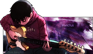
Yeah. First sig I did that's 30 layers+ in like FOREVER. I'd like some criticism because I actually did learn something new while doing this. So.. here it goes.  Yeah. So. It looked better in PS than it does now.. it was a bit brighter. Maybe I have to change the Color options.. meh.. ~Manuel |
|
|
|
Post by junpei on Dec 30, 2006 21:49:03 GMT 1
Very nice. Although I do notice one thing now, on the right arm (arm on the render's left) it looks like there's a white spot or something. IDN may just be me.
|
|
|
|
Post by lazy on Dec 31, 2006 0:55:23 GMT 1
Pixel stretch. Haven't seen that in a while. Nice, but I would make the render slightly bigger, and set the text on Soft Light or Overlay.
|
|
|
|
Post by Valencia Donahue on Jan 3, 2007 5:13:19 GMT 1
Why didn't Kei-Kei's sig get a few more comments than this...? As you ought to know by now, I have a high opinion of your PhotoShopping abilities and no matter how many times you use this render, you rarely cease to amaze me. It's hard to comment on such a fine piece, so here goes. The text stands out, but not blindingly enough to cause the viewer to ignore the rest of the piece. If anything, the pixel-stretch thing made the text more apparent and the render more "clearer" or more noticeable. Like... As if it's underlining it. From a glance, I can see how much effort you put into this and everything looks just right. Best of all, I love the colors. |
|
~MeL~
Newcomer
 MISSING IN ACTION
This ain't right...
MISSING IN ACTION
This ain't right...
Posts: 72
|
Post by ~MeL~ on Jan 5, 2007 5:53:23 GMT 1
As good as always sweetums! :3
^>^ High five from me!
Or a spiffy handshake >.> Which ever you prefer...
|
|
|
|
Post by Kokaku Musha on Jan 7, 2007 16:08:10 GMT 1
Nice one Manuel, always fond of seeing Sora being photoshopped into a great avatar/sig picture/etc. Think you choose well on the background colour, same goes for the text, just love it ^^
|
|
|
|
Post by Kei on Jan 10, 2007 21:54:30 GMT 1
Thanks for bringing this up Valencia (Hehe, there's only one person who calls me that). And, thanks to the one's who posted as well. -- From what I remember doing.. is that it wasn't only a pixel stretch. To be honest, it was the LAST thing I've done. Since this was the second sig I've done since I got Photoshop back, I've tried to think about all the stuff I've used to do (and Shamino's too).. and by doing that, I was able to make the design of the background the way it was. However, the pixel stretch makes it looks busy (though, it actually masks the seriousness of how bright and busy it really was). Those little designs you see behind the stretch that look like chicken scratch? That's text, I used it alot of some of my sigs, and I thought why not this one. And, Ko. I've actually made a background using this render (Yes, I know, but its the last pic with this render). It was accepted into Animewallpapers.com. Here's two versions, one to look at, and one to post as your desktop (Yeah.. I actually forgot people use wallpapers for desktops, but then my buddy Sham reminded me that people would actually use it, and thus make room for icons and such). One's with a poem, and one's without.   ---- But, yeah.. again. Thanks for posting you guys. It actually makes me want to keep at Photoshop. ~Manuel |
|
|
|
Post by Valencia Donahue on Jan 12, 2007 2:39:22 GMT 1
One of the images won't show for me...
I like how the poem goes along with the aura Sora is giving off. The wallpaper does look good, especially because of how graphically meticulous it looks, but somehow... It's not quite something I would use for my desktop. Sure, some are the sort to make room and rearrange their icons and such, but I'm personally fond of simple, somewhat spacious wallpapers.
What you have is like "too much of a good thing" and it's crowded with "distractions". The first thing I see is the center of the wallpaper, particularly to BG Sora's hand, then I see a ton of things that split off everywhere, but it doesn't quite divide my attention, if that makes any sense.
::blinks at what was just typed::
I need sleep.
|
|