Kit Clyner/Sky Hirano
Resident
 MISSING IN ACTION
I think I've been in the dirt long enough! It's about time I start doing my best again!
MISSING IN ACTION
I think I've been in the dirt long enough! It's about time I start doing my best again!
Posts: 795
|
Post by Kit Clyner/Sky Hirano on Dec 28, 2006 2:37:41 GMT 1
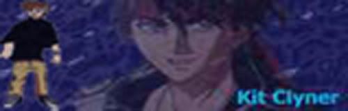
Well, I don't really have that much new stuff from the old thread, so. I'll show you my progress with coloring Ran's sketch of Kit. I don't really think my coloring style does it justice though. *covers head with hands* 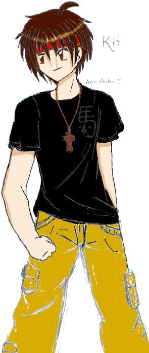 That's pretty much all that's new, sorry. |
|
Kit Clyner/Sky Hirano
Resident
MISSING IN ACTION
I think I've been in the dirt long enough! It's about time I start doing my best again!
Posts: 795
|
Post by Kit Clyner/Sky Hirano on Jan 12, 2007 9:28:43 GMT 1
Hello. I just updated the picture. Now the only thing I have to work on is the pants. If there is anything I can improve, please let me know.
|
|
|
|
Post by lazy on Jan 17, 2007 2:05:03 GMT 1
Don't color your pix like that. Make a new layer, and set it on color.
Shading the pic before scanning it helps.
|
|
Kit Clyner/Sky Hirano
Resident
MISSING IN ACTION
I think I've been in the dirt long enough! It's about time I start doing my best again!
Posts: 795
|
Post by Kit Clyner/Sky Hirano on Jan 17, 2007 6:27:28 GMT 1
Okay, this may come out strange, but how do you do that? I've set it to color, but all it does it color the lines. Also, this was Ran's pic, I just got permission to attempt to color it.
|
|
|
|
Post by lazy on Jan 17, 2007 23:28:07 GMT 1
You should have shaded it first.
|
|
|
|
Post by chang on Jan 19, 2007 6:22:40 GMT 1
Yea, shading comes first, then normal, then highlights.
|
|
Kit Clyner/Sky Hirano
Resident
MISSING IN ACTION
I think I've been in the dirt long enough! It's about time I start doing my best again!
Posts: 795
|
Post by Kit Clyner/Sky Hirano on Jul 30, 2007 0:26:02 GMT 1
Well, I've finally thought up some good drawing and just finished one of them. I tried a CLAMP esque for the head design. Here is one of my original characters, Settan Horigoshi  I'm still trying to get better a folds *sweatdrop* I also fooled around with photoshop to try and make some kind of magic symbol  |
|
|
|
Post by Tong Xian Tian on Jul 30, 2007 0:54:28 GMT 1
It looks cool  Well folds are always a toughy. ^__^;; I still have a hard time doing folds on dresses but as everyone says, practice makes perfect. Keep practicing and I'm sure you'll be able to do folds with ease one day. =D |
|
Kit Clyner/Sky Hirano
Resident
MISSING IN ACTION
I think I've been in the dirt long enough! It's about time I start doing my best again!
Posts: 795
|
Post by Kit Clyner/Sky Hirano on Jul 30, 2007 2:22:33 GMT 1
Thanks. I hope that day comes soon.
|
|
Kit Clyner/Sky Hirano
Resident
MISSING IN ACTION
I think I've been in the dirt long enough! It's about time I start doing my best again!
Posts: 795
|
Post by Kit Clyner/Sky Hirano on Jul 31, 2007 10:30:14 GMT 1
Well, here's another sketch I drew up a few days ago. I tried a CLAMP style of drawing. Here is Settan in his Rendalov high-class outfit.  |
|
Kit Clyner/Sky Hirano
Resident
MISSING IN ACTION
I think I've been in the dirt long enough! It's about time I start doing my best again!
Posts: 795
|
Post by Kit Clyner/Sky Hirano on Jan 21, 2008 5:29:26 GMT 1
Hey guys. I know I've been off away from Hircine for a long time. Schoolwork and senior project have been an eternal pain. But I was able to finish a colored pic. 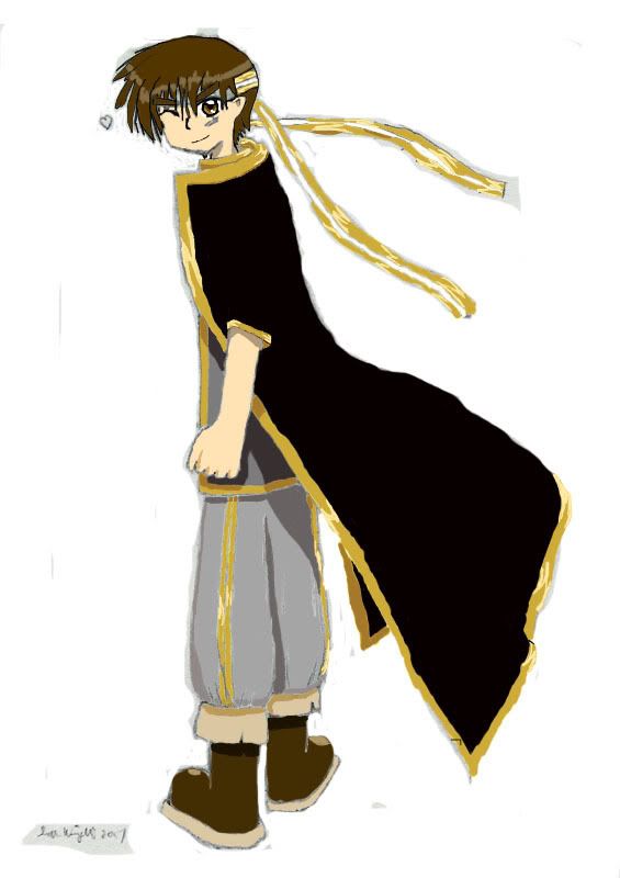 I tried not using all the fancy Wacom tablet junk I used to originally attempt to color Ran's Kit pic from before. Instead, I went with good old fashioned mouse and colors. I thought I did a better job on the coloring than before. At least, I hope I've improved at least a little bit. |
|
|
|
Post by Valencia Donahue on Jan 21, 2008 5:49:54 GMT 1
I have to admit, I can indeed acknowledge that this piece is different, and in its own ways better, from the first picture in this thread... The "dodge every bit of pencil lead" obvious-ness slimmed down a ton. The coloring itself isn't too bad either.
On the other hand, I like how the head is colored compared to the rest of the body because of the distinct and clear lines. It gives off a more precise feel whereas the rest would've looked better with some sort of painted background... Alternatively, the wonky consistency is the factor.
(Meanwhile, I'm working on my senior project too. I've been working ahead and by the looks of it, I made a good choice compared to others who wait 'til the last minute. I wish you good fortune 'cause I'm personally enjoying my topic.)
|
|
Kit Clyner/Sky Hirano
Resident
MISSING IN ACTION
I think I've been in the dirt long enough! It's about time I start doing my best again!
Posts: 795
|
Post by Kit Clyner/Sky Hirano on Jan 24, 2008 3:47:19 GMT 1
Oh, I passed my senior project about a week ago, thank goodness.
Probably the reason the head seems more precise is because I didn't put an outline on the body yet. On the head and hair is a small black line which I used to outline it. I might fix that later.
|
|
|
|
Post by Li on Jan 24, 2008 3:55:36 GMT 1
I'm gonna be honest. Don't do solid black. Do a dark gray so you can use gradients for shading and highlights.
How are you coloring? from the looks of it, it seems you're coloring directly on the background. if you are, make a new layer over it and color. Or dupe the lineart and add layers for differen't clothes.
Nitpicking here. Make sure you remove all pencil marks when you're done. Or go over with solid black lines.
|
|
Kit Clyner/Sky Hirano
Resident
MISSING IN ACTION
I think I've been in the dirt long enough! It's about time I start doing my best again!
Posts: 795
|
Post by Kit Clyner/Sky Hirano on Jan 24, 2008 4:13:39 GMT 1
Actually, I did that. But I did do the solid black lines, so I'll have to fix that.
|
|
Victoria Alexander
Dreamer
My life will be collateral and should be sufficient enough.
Posts: 335
|
Post by Victoria Alexander on Feb 1, 2008 0:09:50 GMT 1
-nudges- if you need some color tips just message me. over all your getting better but the pencil lines are distracting and make it hard to see with the solid colors. wacom is hard when you first start using it but when you get the hang of it, it becomes a good tool. I love using mine. You have to get out of the habit of doing the black just as Li said. If you do a dark grey it makes for a better contrast and shows where your lines are. this also helps when you have shadows going through grey. Try to do more shading when it comes to the boots and clothign where the folds are. It will give depth as well as make it stand out a lil more. Dont be afraid of lining your work mines not that great but as i said before the pencil lines distract the color and make it look unfinished. If you still feel more confertable with the mouse insted of the tablet feel free to use the pen tool maximize your picture and try to stay on the lines as close as possible. Its not easy believe me I used to use a mouse but in the end it will help your art. I tend to use a new layer for each color it helps for when I dont like the one color and can change it without much screw ups. -nod nod- as I said before Im just a pm a way if you have any questions. I may not be the best colorer or drawer but I get along just fine  |
|
Kit Clyner/Sky Hirano
Resident
MISSING IN ACTION
I think I've been in the dirt long enough! It's about time I start doing my best again!
Posts: 795
|
Post by Kit Clyner/Sky Hirano on Feb 1, 2008 6:06:13 GMT 1
Thx Victoria. I'll be sure to implement that.
|
|