|
|
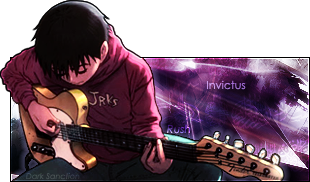
Post by lazy on Dec 27, 2006 16:14:03 GMT 1
Set the text on Soft Light, or lower the opacity. I think it'd look better.
|
|
|
|
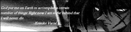
Post by Odin Reeves on Dec 27, 2006 16:50:02 GMT 1
He's got the eyes down. Pretty good match to my DP pic there Junpei. Nicely done.
|
|
|
|
Post by junpei on Dec 27, 2006 21:41:20 GMT 1
  Maverik and Leon, enjoy you two. |
|
|
|
Post by lazy on Dec 28, 2006 0:55:14 GMT 1
They're unbalanced. Too much color on one side.
|
|
|
|
Post by Shamino Warhen Ph.D on Dec 28, 2006 2:46:46 GMT 1
I need to get out of Sig retirement. All of these sigs are the same in my personal opinion. A different color and picture. That's it.
|
|
|
|
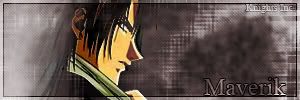
Post by junpei on Dec 29, 2006 0:30:32 GMT 1
 Here ya go Akira. |
|
|
|
Post by junpei on Dec 29, 2006 4:49:29 GMT 1
 Got bored, whoopee |
|
|
|
Post by Odin Reeves on Dec 29, 2006 7:08:12 GMT 1
Junpei, to put it bluntly, you have to many pics in your sig. Frankly, I think two is too much. Besides that, they don't even match one another.
|
|
|
|
Post by junpei on Dec 29, 2006 7:36:08 GMT 1
Odin, you have two pics in your sig.
|
|
|
|
Post by Odin Reeves on Dec 29, 2006 7:39:31 GMT 1
That's where your wrong. I have one picture, which is also a link, and one Random saying generator.
|
|
|
|
Post by Darren Blayne on Dec 29, 2006 7:42:59 GMT 1
RSG shows up as an image file to me.
Last time I checked, an image was a picture, and a picture, abbreviated, is Pic.
I think he's actually right on this one, technically, since, as we all know, you love taking things to that level.
|
|
|
|
Post by Odin Reeves on Dec 29, 2006 7:46:19 GMT 1
For me it's not even appearing at the moment. So, technically it doesn't exist. If it doesn't exist, nothing can be taken to a technical level.
My ill-placed, far-from-understood-logic plays out once again. In my mind.
Besides, if you can't Right-click and select "Save Picture As..." then it's not a pic. Therefore, it's a target.
|
|
|
|
Post by Darren Blayne on Dec 29, 2006 7:48:05 GMT 1
.... thus completely ignoring such options as "View Image" and "Send Image"?
Makes no sense. I like it. I'll give it to you.
Hell... Exalted.
|
|
|
|
Post by Shamino Warhen Ph.D on Dec 29, 2006 7:48:29 GMT 1
I see it. it exists for me. I'm the most important in this thread. Thusly, Odin fails.
|
|
|
|
Post by Odin Reeves on Dec 29, 2006 7:49:58 GMT 1
Shammy, since your on a whole other level, things that classify for us don't register for you. Thus, everyone fails.
My ill-placed, far-from-understood-logic plays out once again. In my mind.
|
|
|
|
Post by junpei on Dec 29, 2006 21:06:12 GMT 1
  Kira and Hikari, done in a similar 'stalagmite' style. |
|
|
|
Post by Kei on Dec 29, 2006 21:20:36 GMT 1
The last two.
They're not bad, but, you have to start paying closer attention to the renders. Right now, the one major problem I see with them (more so the one on the bottom) is the extraction. Start using the Smudge tool (I don't have PS so I dont exactly remember the measure) and apply it to the outlines of the renders, to make it smoother and nicer. The Kira one is not bad, but, for the text, you shoulda spaced it out more. Even though that's how it is, get more creative. Either press the space bar, or, start new text layers, and drag 'em next to the letters to make it more readable. For the Hikari, (again) the render really bothers me. Get ahold of the Burn or Dodge tool, they brighten or darken the tone of the render, adding more color to it. With that, you can do some more with the background you know? (I love the text by the way, in Hikari) Oh, and remember to balance the light with dark. To me it seems off, *shrugs*
I think that's about all I can tell you. For now I still have a decent memory of what I used to do on Photoshop. Keep 'em coming.
~Manuel
|
|
|
|
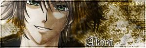
Post by akira on Dec 29, 2006 21:23:27 GMT 1
thanks for the sig Junpei  |
|
|
|
Post by junpei on Dec 29, 2006 21:24:28 GMT 1
Yay Manuel's back, and actually offers constructive critisms!
|
|
|
|
Post by junpei on Dec 29, 2006 21:25:26 GMT 1
 Blurred the edges of the render up, will work on a bit more when I get time. About to leave for party, whoohoo! |
|